
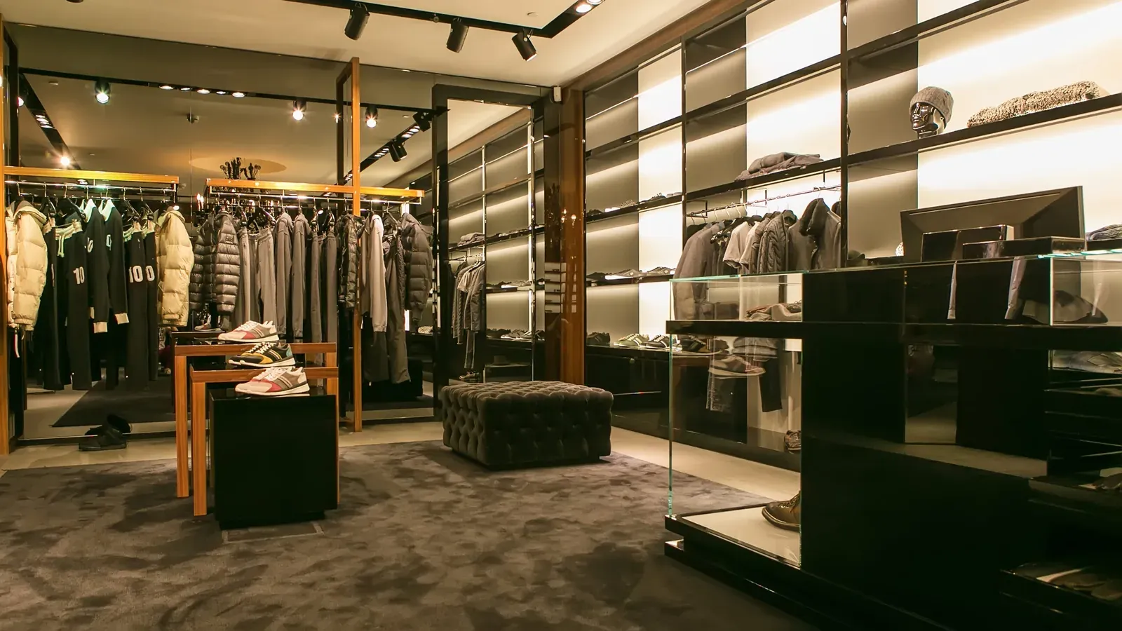
Color is an essential element when it comes to stimulating the senses in a store. It’s tricky to work with because it depends on external effects and is inherently subjective.
Companies also choose their own corporate colors to identify themselves and stand out from the competition. Through them, we send information to our customers’ subconscious, since each color evokes specific emotions.
The choice of colors in a store also helps create a satisfying customer experience, and can even help classify our different products or the sections of a space.
Visually, we can also organize our products by color to create aesthetic, eye-catching visual merchandising.
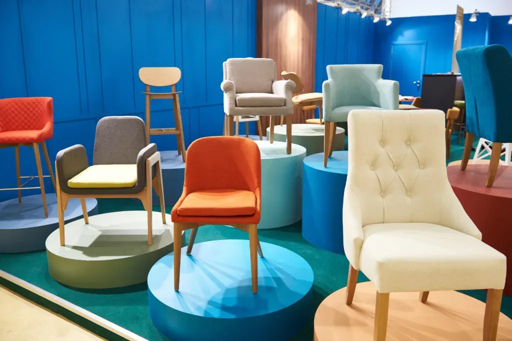
Understanding the cultural meaning of different shades and tones is worthwhile for weaving it into your retail marketing and building a storytelling that speaks to who you are and what you intend to convey. It’s also a decisive factor in purchase decisions.
We should distinguish between meanings and emotions, since meanings carry a very strong cultural component. Emotions, on the other hand, aren’t shaped by culture but are more universal.
Despite how hard it is to standardize the effects of colors on people, we can generalize the following list of colors associated with different effects:
- Red: the color of love and blood. It’s the most passionate, life-affirming and stimulating color. It’s a warm, invigorating color with the power to raise adrenaline and creativity.
It also serves to warn of danger and awaken the senses. Because of its intensity and its role as a natural stimulant, it can trigger anxiety and stress, so it should be used in moderation.
It helps break up the monotony of a space. The meaning of this color can change across different countries, cultures and religions. In China, for example, red is associated with weddings and represents good luck, while in India it is linked to chivalry.
-
Purple: shy and spiritual. It’s the most mystical and ethereal color of the chromatic range. As a cool color, it’s used to convey calm and serenity. It’s a sad, distant and mysterious color, but the impressions it creates vary by shade. Lilac and lavender tones are markedly feminine.
-
Pink: conveys youth and femininity, which is why it’s associated with tenderness and delicacy, though it has also been linked to the childish and the twee.
-
Blue: used to create an atmosphere of harmony and well-being. It’s the color of the sea and the sky. It produces a sense of calm, softness and fullness. It relaxes the body and stimulates the mind. Being a cool color, you have to choose the right shade carefully. Orange can provide contrast, and greens and purples, as complementary colors, pair very well with blue.
It’s the color that represents water, which is why it’s associated with every business that works with it: spas, hot springs, water companies or soft drink brands.
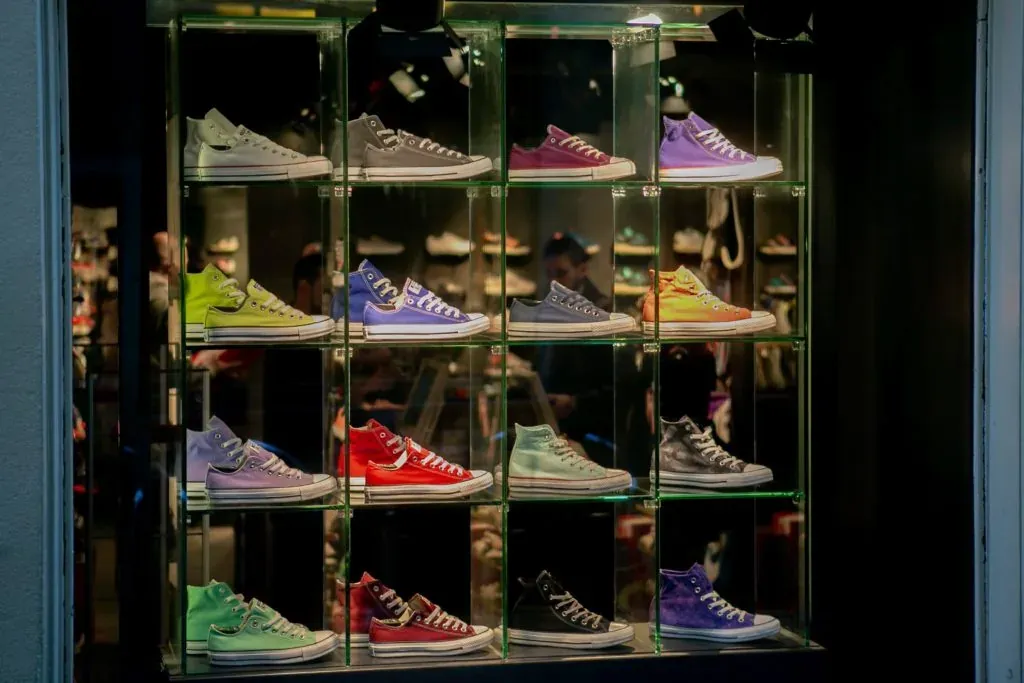
- Black: mystery and distinction. It’s the color of night, of the ocean depths, of infinite space, and it’s the color you choose when you want to stand out for your elegance and style.
The sense of elegance and modernity it gives off draws every eye thanks to its strong visual impact. Because of its neutral character, it can be combined with brighter tones.
Minimalism was one of the styles that leaned most heavily into this extreme contrast, pairing the mysterious aura of black with the radiant clarity of white. Black flattens perspective and demands very specific lighting.
It’s a color that can convey order, peace and calm, but if overused it can feel overwhelming or make a store cold and impersonal.
- White: it’s the sum of all colors. Perfect, luminous, elegant, easy to combine, it’s the symbol of innocence and peace. It also helps create a sense of greater spaciousness.
It’s a neutral color too, like black, and it’s used to communicate through contrast and combined with other colors in stores. When in doubt, white never fails in a shop, since it’s pleasing to the eye and can be used to communicate almost anything.
- Yellow: yellow is a tricky color, because its tone is luminous and is affected by interior lighting. It’s a cheerful, fun color that also energizes people.
It falls within what we might call “active colors,” since it invites movement and exercising both body and mind. It’s also used by many companies that want to communicate speed, efficiency and professionalism, such as transport companies or banks.
- Orange: conveys a burst of enthusiasm. It’s a color full of energy, communication, wisdom and stimulation. It’s the offspring of red and yellow, mixing the happiness of yellow with the energy of red.
It’s an energizing color that encourages activity, which is why it appears in gyms or in restorative pharmacy products, since it lacks the alert connotation we mentioned earlier but carries that sense of vitality and positivity.
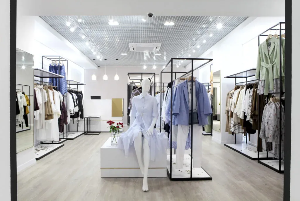
- Green: green is one of the most widely used colors in marketing when communicating a message of cleanliness, health and well-being. Depending on the shade it will evoke one emotion or another, but it’s no coincidence that it’s the color every brand works into its branding.
Restaurant brands use the name of this color in their menus and include it on their listings to signal that a dish, for example, is healthier. It’s the identifying color of pharmacies, of doctors, and of nature. Many brands with eco-friendly products use it to flag this quality.
- Gray: it’s the neutral color par excellence and it’s special, because depending on the person looking at it, it can convey sadness or, on the contrary, balance and rest.
It’s the color of an overcast sky, of iron, of mercury, of aluminum, and it serves to suggest seriousness, maturity, neutrality, balance, indecision, absence of energy, doubt and melancholy. It’s used for products without much appeal or uniqueness.
- Salmon: luminous and classic. Derived from orange, it’s a clear and elegant color. It combines easily with other pastel tones that are often used to enhance—and also disguise—possible flaws in layout and space, creating settings of great distinction.
You shouldn’t use a salmon that ends up too similar to pink, since, if used inappropriately, it can come across as pretentious and quite lacking in elegance.
Color is never seen exactly as it truly is, which makes the result rather relative, since color can mislead us and lead to confusion. That’s why a single color can produce so many different results, depending on the surroundings.
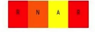
Another point relates to how a color depends on its position relative to the other colors around it. In other words, if we have two identical reds and place a yellow and an orange between them, we’ll visually perceive four different colors:
On another note, it’s worth saying that we have very little visual memory, which is why it’s so hard to memorize a color—we end up with many different perceptions of it.
This happens because these colors are the product of an influence, and we have to distinguish the influencing color from the influenced one. Some colors influence and others are influenced.
The important thing when using colors in a store is to do it with common sense and to play to the type of audience you’re addressing. Only this way will color fulfill its purpose and be the perfect complement to the store.